Thursday, April 26, 2018

Star of Hope!


Hi everyone!  I've been having fun with our newly released stamps, and today I am here with a quilt block patriotic card.  This particular quilt block pattern is called Star of Hope.  :)  Lucky for you and me, there are a lot of ideas on Pinterest for cards with quilt blocks, including patriotic designs, so there's plenty of inspiration out there.  


I cut squares of designer paper with a die and then cut them in half or quarters to complete the block design.  I embossed the sentiment on the designer paper to help it stand out more clearly, but other than that, it was all just simple stamping and a little splattering of diluted ink with a paintbrush.  

I kept trying to put ribbons and flowers on this card, but it just really wanted to be clean, simple, and graphic.  So there you go! Sometimes it seems as though a card takes on a life of its own!

Here are the supplies I used:

Wednesday, April 25, 2018

All Occasion Sentiments and Patriotic Blog Hop - Stamp Simply Clear Stamps


Welcome to today's Blog Hop. This week we are showcasing three sets from our NEW April Release. Last week we concentrated on graduation and other congratulatory events using two of our new sets. This week we will concentrate on the remaining three sets - All Occasion Sentiments SET 1 and SET 2 and Patriotic Sentiments. Combine these sentiments with images, sentiments or Scripture from our other sets and your options are limitless! Hop along with us. The link list is a bit further down.

I love playing with distress oxides, so I pulled out a masculine paper pad, some harmonizing colors and a get well sentiment from one of our new stamp sets,  All Occasion Sentiments SET 1, to make this masculine card.  It's fun to see how the colors play together in different combinations and on different kinds of paper and I love this layout with the designer paper peeking through from underneath.  

I wanted this background to have a rugged, outdoorsy feel to go along with the designer print so I used earthy tones and then faintly went over them through a woodgrain stencil with a damp blending tool. Hard to catch on camera but IRL you can see the subtle effect.  

The sentiment is stamped on one of the punch-out dies that is part of the paper pad.  I liked the way it looked and fit on top of a retired Spellbinders label die, with enamel accents clustered around it.  


Ha, you KNOW when a fella doesn't even feel up to hunting or fishing, he must *really* be sick!  Better send him a card, quick!  ;)

Here are the supplies I used on today's project:
Be sure to make your way through the rest of the hop to see what lovelies my design team mates have created using our new sets.  And come back to my blog tomorrow because I will have another card using them then as well.

Thursday, April 19, 2018

Congratulations & Best Wishes


Hello again!  I am back today with another card from Stamp Simply's new Graduation and Beyond release.  I love and adore how versatile these stamps are and how well they combine with stamps from previous releases!    


For today's card I combined two sentiments from a new set with the "ampersand" from our Welcome Fall set.  I thought a wedding/anniversary card would emphasize the versatility of these stamps and decided to go for a "White Lace and Promises" sort of look.  The lacy designer paper is a dark grey-olive color, and IRL the sentiment panel matches very well, but for some reason (maybe all the silver and shimmer?) it freaked my camera out and in the photos it looks nearly grey-black.

I stamped the sentiment in Versamark and heat-embossed it with white detail embossing enamel so that splattering silver ink over it would not smear the lettering.  There is also some very faint stenciling to add a bit more shimmer.  

This is the largest die of this particular die set, and so I had to find an alternative way to create a border behind it.  I cut another die of the same size from white card stock, trimmed it from point-to-point both horizontally and vertically, and glued it to the back of the darker one leaving a small gap between the pieces.  I used small left-over "negative" pieces from the fancy tags 2 die to cover the spaces, and topped those with pearls.  Hopefully the recipient will have no idea that this was a stop-gap measure!  


There is more of the stenciling and splattering on the inside, along with another beautiful sentiment.  I was hoping the design would be reminiscent of a beautiful mesh-like leaded glass window with light shimmering through the panes.

Here are all the products I used to create today's project:

Wednesday, April 18, 2018

GRADUATION & BEYOND BLOG HOP - Stamp Simply Clear Stamps


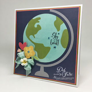
Welcome to our Graduation & Beyond BLOG HOP today. We have many projects to share showcasing two of the sets in our NEW April Release - Graduation Sentiments and Scripture for Graduation & Beyond. With these 2 sets your options for cards for so many types of celebratory and congratulatory events are limitless. Combine them with images, sentiments or Scripture from our other sets and the sky is the limit!

I love when new products spark ideas for how to use older ones, and that is exactly what happened when my new release stamps arrived.  The sentiment that I used for the inside of today's card immediately brought this piece of designer paper to mind. Because the scale of this particular design is fairly large (there are lots of smaller card-scaled prints in the pack), I originally thought it might only be suitable for scrapbooking or maybe for a frame project. Seeing that sentiment made me change my perspective...I just had to use it for a card!  This one measures ~ 6 1/2 inches x 7 3/4 inches.


I used my Tonic platform to stamp the sentiment directly onto the designer paper.  The pad has multiples of each print, and so I used the second one to fussy cut the flowers and pop them up on dimensional adhesives, adding Kaisercraft rhinestone,s seam binding bow, and Prima paper flower accent.  


Inside is the Ralph Waldo Emerson quote that inspired the entire design.  I used a coral hued Copic marker to color in some of the letters.  For the ribbon on the diploma, I die-cut another in coral paper and snipped it to fit atop the white one.  That punch of color really helped tie everything together, if you'll please pardon the pun!  

Here are the products I used for today's project:
And here are the links to the rest of the blog hop!  I've included them all just in case you have jumped in right in the middle.  And be sure to visit my blog again tomorrow because I will have another card to share using these fabulous sets!

Thursday, April 12, 2018

The Greatest Machine on Earth!


Tuesday (in the midst of a marathon sewing week for a reenactment event this weekend) the "accelerator" of my sewing machine quit working.  It is a pneumatic driven foot attachment, and after about 15 or 20 minutes of fiddling with it my husband "miraculously" got it working again.  HUGE sigh of relief, as I still had an entire dress yet to finish!  And so, today's Stamp Simply card is a card celebrating "the greatest machine on earth!"  Believe me, after making part of a colonial era costume completely by hand, I am really happy to be sewing what seems like miles and miles of cotton by machine rather than by hand.   The skirt hem I'm working on now for the style popular in the 1860's is about 130 inches around, not to mention petticoats of similar dimension with multiple tucks.  Just thinking of sewing that without a machine makes me cringe!


I had originally intended to use some gray seam binding for a bow (hence all the grays and no kraft card stock for the layers), but ended up unable to resist the softer, more feminine colors of this ombre` pink/champagne silk.  I added little scraps of lace, tulle, and burlap string to add to the vintage feel.


I thought this paper was nearly too pretty to cover up!  Couldn't resist using the scrap left over from the front of the card on the inside, as well as a strip of a coordinating print.  This sentiment is one of my favorites from our Farmhouse Simple Sentiments set.  

Here are the products I used for today's project:
And here's a little glimpse into what I've been sewing for the last few weeks!  Everything you see here is hand-made by me...using the greatest machine on earth!  ;)

 Chemise, drawers, corset, and cage
Yes, I hammered every single one of those grommets in by hand!

More on the dress, and hopefully some photos of the event, later! Have a great weekend!  See you next week!

Thursday, April 5, 2018

They Shall Be Comforted!


I find sympathy cards so very difficult to make.  Even when making one to have in the card stash for when the occasion inevitably arises (in advance, not knowing who the recipient will be), I find them a challenge.  Having a specific friend in mind and praying as I make the card is sometimes easier, at other times harder.  They're definitely a labor of love either way.


Having lost a dear friend not long ago, I wondered whether a brighter, more colorful, less somber card would maybe help to lift the heaviness of spirit one feels after the death of a loved one.  I decided to use some beautiful floral Graphic 45 papers and the new blueprint distress oxide ink that I recently received from Stamp Simply.  

To make the focal oval for the card front, I misted some watercolor paper with water, then dabbed some ink onto a stamp block and squished and wiggled the block onto the paper to manipulate the color.  I added some drops of water and some splashes of diluted Delicata Celestial Copper ink, dried it all with a heat tool, and then stamped the sentiment.  


I repeated a similar process for the inside of the card, although this time I decided to experiment on regular white card stock to see the difference.  Because the colors do not move as readily on this paper as the paper specifically designed for watercolor, the colors are not quite as clear and vibrant.  The paper buckled slightly but I just went over it with a warm iron to flatten the fibers.  Since I was not "scrubbing" the paper with a brush, it held up well enough, although I do prefer the look of the brighter colors.  The one advantage of using regular card stock inside is that it is easier to write on than textured watercolor paper.  

I'm grateful for God's promise of comfort, and for friends who stand together to share the burden of grief!  I hope this card will be a comfort to the one who receives it.  xo

Here are the links to products for today's project: