Thursday, June 9, 2022

My Refuge and My Fortress


Masculine cards are often quite challenging but often (at least for my guys!) less is more, and that is especially so when the card needs to be sent via the postal service.  This card with its beautiful Ocean background paper, an embossed sentiment, and Copic colored focal image (all from Stamp Simply) on dimensional foam adhesive should go through those postal machines without mishap. If this were to be hand delivered instead, it would have been fun to add a big nautical knot for an accent!  


With watery backgrounds like this I will often use splashes of diluted white paint to integrate the foreground image with the background, tapping a loaded brush over my finger (like striking two wooden drumsticks together) to create the splatters.  The amount of water you use in relation to the amount of paint will determine their size.  I should have tested on a scrap before splashing this time!  I was a bit disappointed that these splats ended up so big and round and opaque, a sure sign that my paint was a bit too diluted.  I blotted some of them with a paper towel but because they're water-based on top of Memento ink, I didn't want to fiddle with them too much!  So let my experience be a lesson for you to test on a scrap first!


The font of this sentiment from A Godly Man coordinates perfectly with those from our Lighthouse series.  

Supplies:

Thursday, June 2, 2022

Kinder-Grad Congrats!


Hi friends!  I'm here with this week's Stamp Simply project.  I suppose I have been feeling nostalgic since Matthew graduated from FSU a month or so ago! I was remembering his kindergarten graduation (still have his little white gown), and even the big red brick building where I went to school way back when.  (Did y'all have a red...or a yellow...brick building? We had both that were built in different eras!) Anyway, all that is what inspired this CAS little kinder-grad card.  


I used the long skinny banner die from our fishtail banners to cut the pencil from scraps of paper adding accents with a score tool and old zig-zag edge scrapbook scissors.  The cap stamp, one of the tiny stamps in our Stick People set, has its own tassel but I thought it would be fun (especially since FSU colors matched these papers!) to make one from floss.  Couldn't find my box of floss so I ended up using burgundy and gold regular ole sewing threads.  


I kept the inside super simple too.  I designed this card so that even the earliest of readers would be able to read and understand it, but that their parents would have warm-fuzzies remembering their own school days too!  

Thursday, May 26, 2022

More Coffee!


Can there ever be enough coffee or coffee stamps?!  Not in my book!  :)  

We already have several great Stamp Simply coffee stamp sets, but we are releasing some adorable new additions to the collection! I had so much fun playing with them and combining them with some of our other sets just to see what I could come up with!


The first card I'm sharing is simple and straight-forward, using stamps only from the new set.


There are cups in varying shapes, styles and sizes with accompanying dies that make card-making so fast and easy.   The front of my card features a striped cup colored with Copic markers. 


I used the cute polka-dot cup for the inside.  It was fun pairing the new set with this broken porcelain mosaic designer paper.


I don't know about you, but I always drink my coffee with a little cream and sugar, so I decided to go for an extra challenge with this new set by doing a little paper piecing, "repurposing" and mirror stamping with these new stamps and our Seasonal Decor set to come up with some cute coffee accessories.  


This creamer is one of the new cups with the addition of a spout cut from the pitcher in the Seasonal Decor set.  


The sugar bowl is made by mirror stamping the handles, adding a portion of an upside down cup bottom with a little knob made from a trimmed piece from the candlestick, also from Seasonal Decor.


The sentiments from this second, slimline card are from one of our earlier coffee stamp sets just to illustrate the fact that everything seamlessly mixes and matches.  So much fun to let your imagination run with ideas for using them in different combinations!  

This taller card made it easy to add a pocket for a gift card.  

Supplies for May Your Cup Overflow:

Supplies for Tall Coffee with cream and sugar 

Thursday, May 19, 2022

Proud to be an American


Hello all!

Usually my cards take shape from the outside in, but today's card was inspired inside-out by one of the printed rectangles in a new pad of designer paper.  It's another super simple design since most of the patriotic cards I make go to male recipients and for them, the less fuss and frills, the better.  


You'll have to look closely to see that the oval that is positioned behind the flag is stamped with text.


Since the text on the front turned out to be so faint, I decided to try stamping the inside with stamped off brown ink before stamping the metallic ink on top.  It came out a little darker than I had hoped, but I like the fact that it is more easily visible.   It adds some nice detail to the card without being labor intensive.

Since I can't even read this sentiment without hearing the song in my head, I just had to include the little music staff from God Will Take Care of You.  The stars are from our Patriotic Sentiments set.    

Supplies:

Thursday, May 12, 2022

Yooper's Kitchen Decor


Hey everyone!  

My husband is currently in the kitchen cooking up a batch of his amazing red sauce and it smells so heavenly in here!  Olive oil, sweet onions and lots of garlic!  He hasn't even gotten to the tomato part yet!    

Since he is of Italian heritage, we eat a lot of Italian food in our household, although now mine has to be gluten-free and I miss the real thing sometimes.   Patrick is from the Upper Peninsula of Michigan, and it seems like it's Italian everything everywhere when we visit up there!  That is what gave me the idea for a Yooper Kitchen card for this week's Stamp Simply project.   


This card makes me smile because we actually have quite a bit of Yooper decor IRL...in fact, I drank coffee from Patrick's Yooper coffee mug just yesterday morning!  Almost every Christmas my sister-in-law sends him some Yooper something.  He often wears an orange UP hat that makes everyone do a double-take.  Some people think it is a Tennessee Vols hat until they look a little closer...then they usually have to ask what it is because it is mostly only real Yoopers who recognize the shape of the map of the UP.  


Small print designer paper and some wood grain texture paper made this an easy card to make and even keep flat for easy mailing.   The pitcher was stamped on printed paper (I thought that it looked like an olive branch) but the olive oil bottle and  "Love" box were stamped on white card stock and colored with Copic markers.


Here's the inside, which includes the definition of Yooper and a big bold 906!  Yooper actually is Patrick's nickname from when he first joined the Navy way back when!  We were sooooo tickled when these Stamp Simply Yooper sets came out and it has been fun to play around combining them with other sets that we have!

Supplies:

Thursday, May 5, 2022

Happy Mother's Day!


This week marks six years ago that my son Matthew and I took our trip to Italy with the Orange Park Chorale. Seeing all those photos pop up in my memories on FB was what inspired my card for this week.  

I have to laugh because this is one that I may just have to keep for myself!  But that is what is so special about hand-stamped cards...they can be made to be so very intentionally personal for the one who'll receive them.


I love the look of this Prima vintage paper, with its soft colors, lovely script fonts, beautiful scenes from Italy and the postcards/travel theme.  How perfect!  I used our Stamp Simply Summer Roses floral cluster to frame a scrap of the paper, adding a few small accents from the paper pad along with a Mother's Day sentiment stamped and die-cut with a fishtail banner die.  It made me happy that the sentiment was narrow and everything could be arranged to allow the script and the background Ink Drops paper's colors to peek out from underneath.  Everything came out softly shabby chic, which I love.


The Prima paper reminds me of Venice (and the Bridge of Sighs), although the pad is actually scenes from Capri.  


The Ink Drops Candy paper reminds me of the colors of one of the photos that I took right before one of our concerts there, so you can see why this card might feel sentimental to me!  (I might have to make a scrapbook page using the same elements!)      


Our trip took us from Venice to Florence, Lucca, Sienna, and Rome, with four concert stops along the way.  On our very last day there we sang for Mother's Day at the Vatican! 


I doubt any Mother's Day will ever top singing together with my son at the Vatican in St. Peter's Basilica the way we did on Mother's Day 2016!  It was the trip of a lifetime!

On this Mother's Day I will be missing my own mother, hoping to hear from our son, and gratefully celebrating my Mother-in-Law although we won't be able to be together.  Yay for FaceTime, right?!  And I am also hoping that someday soon my husband, son and I can take another fabulous trip abroad!  (Of course, after nearly two years of Pandemic restrictions, I am happy to go just about anywhere!)

I hope you will be inspired to look through your photos and memories and stamp something sentimental and special for you and your loved ones!  Happy Mother's Day to you and yours! Enjoy the weekend!

Supplies:

Thursday, April 28, 2022

For Baby Girl's Father-to-Be!


Hello and welcome again!  

Today's Stamp Simply card is a sweet, clean and simple project that is super quick to put together in spite of a very tiny bit of fussy-cutting.  I love the unexpected color combo and this cute banner frame (I've used it before, here) and thought it would make a fun card for a father-to-be whose wife is expecting a baby girl in just a few months.  (It is amazing that the same papers can have such a different feel from one card to another, one for celebrating the beginning of life and the other for grieving the end of a life well-lived).


Here is a close-up of the fussy-cut stroller.  I stamped it in Memento ink directly onto the printed frame, then again onto the pink designer paper.  What makes it so fast and easy is that thankfully there's no need to fussy cut the stroller frame, only the bassinet part which is almost all easy, straight line snipping.  The only tedious part is the one tiny little curve where the two come together.

I colored it all with Copic markers, adding just a hint of shading to the bassinet part to make things look a tiny bit more three-dimensional.  


One of the things I love is that while the colors are not quite traditional, they are completely girlie but still work for Dad!  And just look at all those adorable girlie shoes!  Aren't they fun?!  They're gonna give Daddy just a hint of what he's in for!  ;)

Supplies:

Thursday, April 21, 2022

Getting Ready for Father's Day!


Mother's Day is coming soon and Father's Day will be not far behind it, so it's time to think ahead and order supplies for those projects.  I'm here today with a fun card full of masculine textures and traditional "guy" things (although I will confess that there are as many tools of mine in our garage as there are his, including a belt sander and drill press)!  


The sentiment and dies I've used for today's project are from one of our newest Stamp Simply sets, A Man of Knowledge.   Since my husband is not that into books (unless they're cookbooks!) I wanted to take things in a different direction.  I combined this sentiment with several prints from two paper pads for his card.  I really love how realistic these papers look.  Patrick was a career Naval Aviation Maintenance Officer so this ought to be right up his alley.  These prints would be great for both of my brothers who are car enthusiasts too! 


The little printed square sentiment from "Workshop" gave me the idea to mount another smaller square card onto the front of the larger card.  The squares are all cut using various nesting sizes of Spellbinders square dies, and the sentiment is a punch out.

I used gray card stock and silver ink for those die-cut gears.  If I'd had more metallic paper I could have used that but I'm almost completely out.


The inside of the card has more of that cool paper that looks like embossed metal.  It makes me think of the drag races since so many cars' trailers have it on them somewhere or another!  The sentiment is a favorite familiar scripture from our Welcome Baby set.

Supplies:

Thursday, April 14, 2022

To the Graduate!


Hi y'all!  Graduation season is almost here!  Our son will be graduating from FSU in just a few weeks.  I am so excited for him and so so proud. 


This Congrats graduation paper is so fun!  The colors practically glow and a little distress inking on the edges helps to accentuate that illusion.  Of course, black makes everything pop!  I cut two of the graduation cap and trimmed the board and tassel from one, popping it up on dimensional adhesive to make the cap look more 3-D.   The tassel was colored with gold Wink of Stella and there's a black rhinestone for the cap's button center.   


The inside of the card is a little "study vignette" using some wood grain designer paper for a desk with our new books stamp and matching die, the diploma, an even some stenciling for the background "wallpaper."  For the diploma I cut one from white card stock that I colored and shaded with Copic markers (it looks like some parchment calligraphy paper that I have!), and a second one from a scrap of black for the fussy-cut ribbon center.  Those little details take some time but they really add a lot and I think they're fun to do.

Supplies, all from Stamp Simply:

Thursday, April 7, 2022

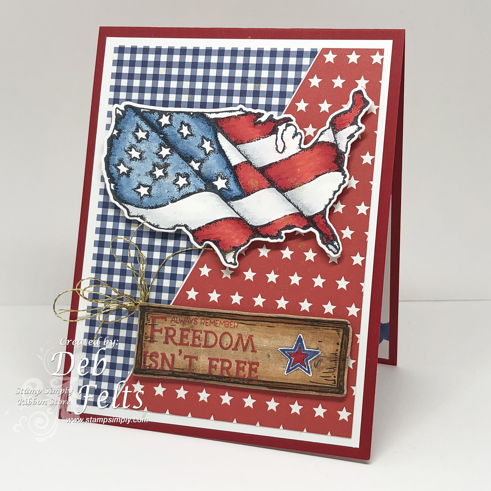
Freedom Isn't Free!


Between stamping ahead for the upcoming holidays and knitting some red, white and blue plaid socks for Sock Madness, it is feeling quite patriotic around here this week!


The socks are color work plaid with a double-knit pocket, so I am learning two new techniques!  I have a feeling I will get bumped this round because it was also concert week (the chorale I am in sang Rutter's Requiem Thursday evening and Sunday afternoon) and Matthew was home for a visit, so knitting was low on the priority list, but the needles are clicking away now if by some miracle I might still qualify for Round 3! 


Holly used our stamp set with the more traditional flag in it for her post on Monday, but my card uses a more modern rendition of the flag waving across a map of the good ole US of A.  I love both sets and find that sometimes I might choose one over the other depending on the occasion.  For a fun 4th of July event I might use this one, whereas for a card for someone in the military I might go for the more traditional/formal.  


For the front of today's project I combined some wood print designer paper and the tray/plaque from our All Seasons Decor set with the sentiment, accented with a tiny red white and blue star.  


The inside actually almost looks like another card front (and very well would work as one!) using stamped stars with the Pledge of Allegiance.  The square "God Bless America" is a printed sentiment from the paper pad that I cut out and matted with Spellbinders' classic squares.  There is just a hint of sparkle from a light splash of diluted Delicata ink both inside and out.    

Supplies:
My heart is filled with love and pride for my own country, but also with respect, admiration, awe, and so much sadness for the people of Ukraine.  The situation there has made people the world over so very much aware of the terrible cost of freedom.

With continuing prayers and much love.