Thursday, August 25, 2022

To Every Thing There is a Season


If you're like I am, you can't just read that title without singing it! Turn, turn, turn!  ðŸŽ¶  ;)

I'm here with a Stamp Simply project that includes all of this week's featured florals, a series that we have had so much fun with this Summer!  This is the last week of the promotion, so it only seemed appropriate to do some sort of "finale" using this week's sets!  I enjoyed coloring them and I love the way they dress up our classic white Pottery Barn dinnerware.


I didn't really worry much about trying to coordinate colors between the images.  I just chose seasonal-appropriate colors that I love for each one, then tried to tie them together by splashing and splattering with gold and copper Delicata inks.  The Spring set is pansies which I colored with bright purples, pinks, and oranges.


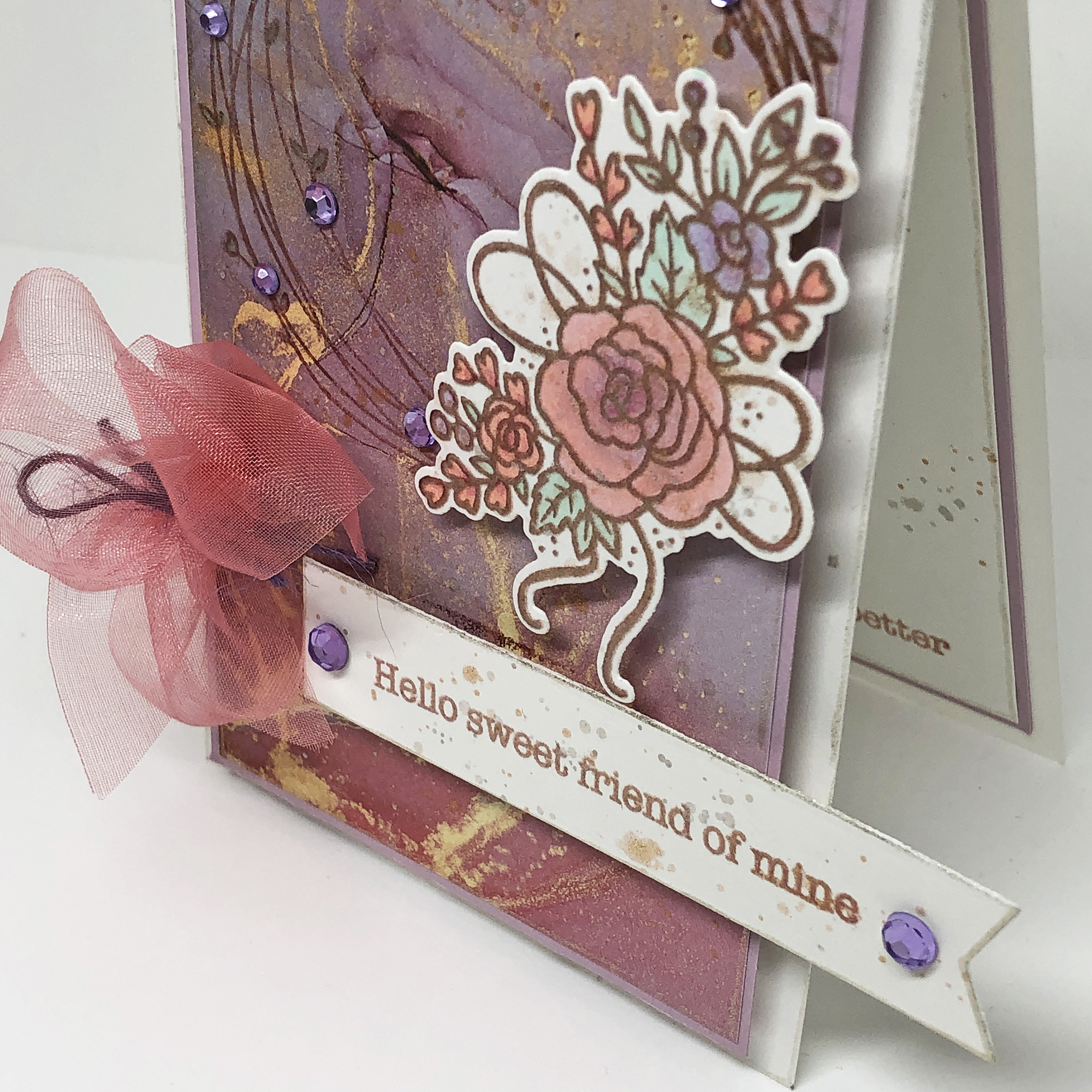
This one is the Summer rose, which I colored with corals and pinks.  


There are sunflowers for Fall...

...and poinsettias for the Winter holidays. 


The floral sets come individually or in various bundles, including the coordinating die. The scriptures/sentiments used inside and out go perfectly with this theme and are from our Sunflower Season set.  

Supplies:


Thursday, August 18, 2022

Hello sweet friend of mine


Hi y'all!  

Sometimes I end up with scraps of designer paper that are not wide enough for an entire card front but they're just too pretty to cut into smaller pieces!  That's when it's fun to make a scrap card like this one!  The narrower card base is 3.25 x 5.5 inches but the card overall (including the banner overhanging the edge) is 4.25 x 5.5, so it will still fit in a standard envelope.


Of course, our fishtail banner is the perfect choice for an overhanging sentiment like this...this sentiment from our Typewritten series is a beautiful complement to this lovely Summer Seasonal Wreath.  And here is a secret...I accidentally smudged cocoa ink on the edge of this one so I took an emery board to it and then went over the edge with a metallic gel pen.  Voila`! Between that and splashes of metallic ink, my mistake is well-hidden.  Going around the edges of the base of the card and the designer paper accents the narrower card base and even makes it look like it was done on purpose and not mistake-inspired! ;)


The inside has another typewritten sentiment and more splashes of silver and copper ink to go along with that metallic gel-pen edging.

Supplies:

Thursday, August 11, 2022

Sing to Him a New Song


It is rare that I make a card that doesn't use designer paper because I love it so much, but this is one of those days!  Today's Stamp Simply card is made with only one stamp set along with several colors of ink and Copic markers.  The branch was stamped with Memento ink and colored with Copic markers.  Then I used a transparent soft blue ink and a scalloped circle to mask and sponge in the sky background.     


I used Spellbinders' rectangle dies to cut a window through the top layer and green mat to allow the layer below to peek through.  It's white card stock with the same sponged sky applied over the music staff and sentiment.  I also gave the paper an edge of color with a red Copic marker, since I did not want to add a fifth layer which would have made the card even heavier.  That pop of matching red really grounds the rest of the red scattered throughout the design.


Here's the inside, just a pretty sentiment, and a small colored twig to carry the theme from the front to the inside.  (I might have opted to add the same sponged sky to the inside had my sponge not started to disintegrate!  I need to order more).  

Supplies:

Thursday, August 4, 2022

The Light Shines...He is the Light


Hello everyone!  This week's Stamp Simply project is a card made with Summery cool blues from Craft Consortium's Ink Drops Ocean designer paper, paired with one of Stamp Simply's Lighthouse stamp sets.  This one is of the lighthouse at Keweenaw Peninsula waterway's south entrance which has several lovely scripture sentiments to go along with the beautiful images.


I used pale blue-green, warm and cool grey Copic markers to color the lighthouse, keeping the tones very muted to harmonize with the background colors.  Only one tiny splash of brick red at the top, just as the actual lighthouse.  The bow is a layering of sheer gold and silver ribbons, frayed white tulle, and silver cording.


The lighthouse and sentiment were both stamped in grey ink so that the card is almost monochromatic.  There are splashes of copper and silver to help integrate the grey of the lighthouse with the Kraft and blue/turquoise colors of the designer paper.


The inside has another slice of the same paper, with sloshes and splashes of those gold and copper hues to keep the watercolory ocean theme going throughout.

Supplies:
Remember, there's also still the Flower of the Week Sale (Tulips and Roses through Friday) so be sure to visit the store's blog for more ideas!  There'll be a new Flower of the Week beginning Saturday morning.