I am fascinated by these never-ending cards! The hardest part of this challenge is finding enough images to fill up 4 flips. I used my Just Bugz OCL set from i {heart} papers, which I LOVE!
I stamped images using Palette Noir ink after constructing the card. That way they are all oriented in the proper direction as you progress through the never-ending opening. I really wanted to color with my new copics, but the mechanics of this card and the paper I am using would not allow that because of the bleed-through that occurs when you blend properly with the markers, so I stuck with my tried and true prisma color pencils and baby oil. I used a gold Spica At-You pen to color all the flowers' centers and the pollen on the bees' antenae. The bees wings were colored with a clear Spica, so they are sparkly too! It is so hard not to add something dimensional to a card, but with these it really is best to leave them relatively flat.
When I have more time, I want to make another one with layers, using some of that great Basic Grey honeycomb paper.
I'm very excited to say that I won a sketch contest at OCL (see my submission here)...I used my bear-ly fishin' set from ihp following sketch inspiration Cambria found from a card by my friend Denise! So I will have another OCL set coming my way! How about that?!
Tuesday, March 31, 2009
Sunday, March 29, 2009
Banana Split Sunday!
This week's Banana Split Sunday challenge from 2RedBananas is to use gems in your layout. I am so very blessed to have lots of gems in my life! This weekend I went to Epworth by the Sea with our church's confirmation class and the 7th grader I'm mentoring. She is a real gem! Her name is Rachel and she is such a doll! What a privilege it is to be her mentor! We had such a great weekend! I am looking forward to seeing her grow as she continues her walk with the Lord!
I opted for a long card layout to include as much of this beautiful Webster's Pages designer paper as possible, then added flame dewdrops to accent each flower's center. I colored the sentiment from the set, Quotes, with markers directly to rubber and stamped it in the upper right-hand corner, adding a Spellbinders' butterfly (this was the die we were given to use in the final round of Spellbinders' DT competition) to mimic the butterfly in the designer paper. I scribbled with a Copic multiliner to give the diecut some detail, then stroked on some faint shadows with both Baja Breeze and Memento Rich Cocoa inks with an aquapainter. A Copic clear spica pen added sparkle to the butterfly and blossoms. Using a craft knife, I cut slits in the paper to accomodate a layered ribbon accent using May Arts aqua mesh and wrinkled brown ribbons.
This card was a bit of a departure from my usual style of stamping, but I'm pleased with the results. I was hoping to show this gorgeous designer paper to its best advantage. Hopefully I accomplished that goal!
I hope you'll play along with us for this challenge...there will be a prize for one lucky Banana who submits their card! Be sure to visit the 2RB Blog and leave a link to your creation to be entered!
Thursday, March 26, 2009
Lovely Easter Lily
I absolutely LOVE this beautiful Easter Lily, from Sweet 'n Sassy Stamps, and have been hoarding this paper which was left over from one of my first projects when I joined the SNS DT. Last week I missed making a card for Korin's PCP sketch...I really like this sketch, so I wanted to make a card with it. I flipped it because I wanted to keep the vertical lines to go along with the column of text that is faintly printed in the designer paper.
I stamped the lily on Blush Blossom card stock, then colored it with prisma color pencils and baby oil. I stamped a second flower center, coloring it in rich browns, then giving it a liberal layer of glitter and a deep purple-brown pearl accent.
Do you think that this could also qualify for this week's SNS challenge to use pink and brown? Or is it too peachy?!
Wednesday, March 25, 2009
Color Dare!
I was feeling stumped by this week's Color Dare--Night of Navy, Always Artichoke, and Pretty in Pink with optional colors Close to Cocoa and Cameo Coral--until my brand new stamp set, Flowers for You, from i {heart} papers arrived. I took one look and knew that this bouquet would be the perfect stamp choice to try to *work in* so many colors.
I stamped the bouquet using Palette Noir ink, then colored a faint Night of Navy background shadow using a very damp aquapainter. I painted the leaves and stems in Always Artichoke with a few touches of Night of Navy, and the flowers of Cameo Coral and Pretty in Pink.
I tried to work in a piece of designer paper with my design, but really preferred the less competitive solids and settled on a piece of chocolate and pink Basic Grey Bittersweet 6 x 6 print that reminds me of a palette knife painting. I used multiple mats, some circle punch tabs, and Moxie buttons tied with cording in my layout in an effort to incorporate all of the challenge colors. I am really having a lot of fun with these Color Dare challenges, and hope that you are finding inspiration each week in the cards that we make using the off-the-beaten-path color combos that Riley keeps coming up with! Be sure to blog hop to see what she, Stephanie, and Mandy have come up with using these colors!
Monday, March 23, 2009
Itty Bitty Basket
Today's SCS Technique Lover's Challenge was so much fun! Lynn provided a link to the template, which includes a patterned paper exterior and inner liner which combine to make the cutest little basket!
This basket is small enough that I was able to use left-over scraps from other projects to make it. I was hoping for something elegant and special for a dear friend. The tag was stamped using Hero Arts' Many Hearts (on sale at i {heart} papers now!).
I think my friend will love it! I hope you do too!
Sunday, March 22, 2009
Bear-ly Fishin'!
I am having a blast with all of my new OCL stamps from i {heart} papers! I was determined to get to stamp tonight so that I could finally put ink to this stamp, Bear-ly Fishin'! Isn't he just the cutest thing!?
Have you ever been so excited to have a fish on your hook that you jerked the poor thing clean out of the water? That's what this card makes me think of!
I stamped the bear in Palette Noir ink, then masked him off to add the grass/flowers and sponge in some Bordering Blue sky. I used prismas and baby oil to color him in. I added some bright yellow Copic colors to the flowers, and dotted their centers with a white gel pen. I used nestabilities (standard circles, large and small) to cut out the large circle and emboss its edges. The smaller circles are punches. I had some scraps of this great fishing lures paper from Sugartree JQ Outdoors, and the rulers from Sticker Studio. All of the papers were sponged with Tim Holtz tea dye distress ink. I couldn't resist adding some monofilament between the focal image and the smaller accent.
This sketch is a sketch by Cambria that was posted as a contest on the OCL forum. I'm so glad that I got to play along! So fun!
Birthday Cupcake
Banana Split Sunday!
Jami at 2RedBananas gave us this William Templeton painting, Banana Bandit, as our inspiration for this week's Banana Split Sunday challenge. My eyes were drawn to the colors and textures of the sky, walls and foreground. Looking through my stash of paper, I found a sheet of DCWV Old World paper that mimicked the same colors and textures, and things started to flow from there.
Don't you just love this adorable dog from Jami's set, Gunther's Greetings?! When I first got my 2RedBananas sets and saw him, my heart melted! Then I found these fun companion prints from Sonburn Designs and just had to have them. I'm so glad they worked with the colors for today's inspiration because I've been wanting to ink this puppy up! I stamped him in Memento Tuxedo Black ink, then colored him with prismas and baby oil. A few faint shadows were laid in to his left using a Copic Blender Pen and cool gray. I paper pieced his scarf, then added a little dog-tag charm. The sentiment was inked with Really Rust and Brocade Blue markers, then over-stamped with stamped off Creamy Caramel paw prints. I added a few buttons to bring more blue forward and tie the design together.
For the inside, I added a matted strip of the designer paper, then stamped a faint paw print in the bottom right corner.
I know just the dog-lover who should receive this card! You know who you are! I was thinking of you the entire time I made it! :)
Make sure you visit the 2RedBananas blog to see what our other designers were inspired to create! Or you can click directly to their individual blogs from their links on the sidebar.
Saturday, March 21, 2009
i {heart} papers blog candy!
Tracy's got blog candy from now until Sunday night! She created a beautiful layout from pictures of her honeymoon, so go take a peek and leave a comment!
Thursday, March 19, 2009
Seussical the Musical!
Tonight was Matthew's first performance in Fleming Island High School's production of Seussical the Musical. He had THE best time! He was one of the Wickersham brothers, a trio of monkeys. Here you can tell that he really got into his part! (Unfortunately, some of the pictures are blurry because we were not allowed to use flash).
This is a picture of Matthew with some of the main characters: the Cat in the Hat, Gertrude and the Mayor.
We were very grateful to have had so many friends in the audience! Lots of our friends from youth group were there, and my stamping friend Michelle Redman even came across town to see it! That made us feel so special!
I'm a proud mom tonight! Glad to have one more opportunity to see it before the magic ends!
Wednesday, March 18, 2009
i {heart} papers Sketch Challenge
Our i {heart} papers design team was issued a sketch challenge by our team-mate, Kendra. I needed a monkey card (keep reading!), and thought that the leaves from Changito the Monkey would make a colorful edge for this cute image from Changito Dos. I flipped the sketch in order to fit these adorable monkeys into the leaf frame. I really love how my card turned out!
First I traced an oval onto a sheet of white cardstock, and then stamped the monkeys inside and the leaves around the edge using Palette Noir ink. Each image was stamped again on another piece of white cardstock, colored and cut out, then popped up on dimensionals to give some depth to the focal image. I used a combination of Copic markers and prismas with baby oil to color them in, then used a cool grey marker and blender pen to add some shadowing.
Often when I stamp I have to creatively correct something! Do you have that problem? This time I forgot to stamp the little curlique vine before adhering the leaves around the outside edge of the oval. Rather than risk messing things up by trying to remove the adhesive and stamp the vine in place, I just sketched it in with my Copic black multiliner, and colored it with my prismas. If you decide to CASE, you must remember to stamp your vines in first!
I used the soft yellow flip side of some Carnival Flowers designer paper as the background for my card base, and stamped the sentiment on the bottom right corner using Palette Noir ink. For the horizontal element of the sketch, I cut a strip of Wild Wasabi card stock, punched it with a scalloped edge punch, and topped it with a strip of brown double-faced faux suede ribbon (which looks almost black in this picture). A button-centered prima accents the intersection of the frame and ribbon.
I have big plans for this card already! My son, Matthew, is one of the Wickersham brothers (who are monkeys) in Fleming Island High School's production of Seussical, the Musical, so this card will be an *I'm SO proud of you* card for him! We homeschool, but he auditioned and got a part even as a freshman, so I was proud of him from the git go! He has been a walkin' talkin' Seuss-machine since rehearsals started, and I can't wait to see the performance (this Thursday and Friday)! Break a leg, Matthew!
Kendra is running a contest for this sketch from now until noon on Tuesday, March 24th. Just leave a comment on her blog with a link to your card and you'll be eligible to win a prize! Make sure to visit the rest of the i {heart} papers design team members' blogs to find some inspiration! Links are on the sidebar!
Color Dare!
This week's colors for Riley's Color Dare seemed daunting at first, but then the idea came for a sunset sky of Regal Rose and Almost Amethyst with a silhouette of Night of Navy. I thought the image looked very peaceful and serene, so I decided to keep the rest of the card very uncluttered. This is a fall-back-to layout that can be dressed up or down...hopefully you'll agree that this is an elegant card that would be bright and cheerful but not overwhelming even as a sympathy card. I have great difficulty making sympathy cards and find that I often need them spur of the moment and then just can't get *in the mood* to stamp when I'm sad. Having a few appropriate cards on hand is a bonus.
The sunset sky was sponged on glossy cardstock, then stamped with SU's Upsy Daisy in Night of Navy. The image and Night of Navy mat were cut and embossed with Nestabilities. I used a cuttlebug embossing folder on Coredinations cardstock for the background panel. The dark mat IS Night of Navy, although in the photo it looks almost black. Accents include pink Kaiser Pearls (I didn't have to search for them this time!), and ribbon/fibers by Adornaments.
Sunday, March 15, 2009
Just between friends!
What a privilege it is to begin online friendships at Split Coast Stampers and then to actually get to extend those friendships from the internet into real life! I was so excited to have that opportunity at Copic Marker class in Pensacola, and can hardly believe I've had this blessing for the second time in just a few short weeks! I have had such a fast, fun weekend that I wanted to just take a few minutes to post a picture and say how thrilled I am to have gotten to meet such sweet ladies in person! Vicky, NancyRuth, and Lois...it was such a pleasure! I hope that you'll look back on this weekend with memories of happy stamping and that we will get to stamp together again!
We met at Faith Hofrichter's stamping retreat at Stephen F. Foster State Park. There were about a dozen of us, lots of great *Faith* projects, a shoebox swap, some delicious food, and fun fellowship! My only wish is that I would have been able to get there earlier and stay later...and I should have taken more pictures! I hope that y'all will share yours!
Glad you made it home safely...seeing you on Split Coast will never be the same! {{hugs!}} and sweet dreams! I think we all will sleep long and hard tonight!
SNS Design Team Round-up
It is fun to find inspiration from different places...for today's card I was entirely inspired by a floral print from the Basic Grey’s Sugared 6 x 6 designer paper. When I looked at it, it made me think of bright yellow annuals and the chocolate bunnies that line the shelves of every store! I decided to go with the flow and allow it to dictate which colors and images to use.
First I stamped these adorable animals from I'd Pick You in brown ink, then colored them with prismas and baby oil. I layered some designer papers (solids and prints), using my sewing machine to zig-zag around the edges. I added a piece of lace (left over from a Prima paper pack from a previous SNS project) because I really love how it brings out the golds in the paper. I punched a flower with a scallop-edged circle punch, then snipped it not quite to center to make petals. A sentiment, stamped on a piece of gold designer paper textured with a cuttlebug dots embossing folder and sculpted over a pop dot, makes the flower’s center. I used some scraps of Basic Grey's polka dot paper to cut some oval shapes to make leaves, snipping them about half way along an imaginary vein and overlapping the ends to give the leaf some dimension. A Martha Stewart fern punch adds some texture and softness to the arrangement. A little piercing gives a bit of interest to the opposite side of the image for balance.
Think Spring!
I love Spring! There's nothing like the burst of new life that the warm weather brings after the dormancy of winter.
All my life I've lived in the South. I've always wondered how the azaleas, redbuds, and dogwoods know that it is Easter time. It seems to never fail, no matter whether Easter is early or late in its cycle, that the dogwoods are blooming at Easter to tell their Easter story through nature as Christians everywhere are retelling theirs through song and drama. Each Palm Sunday our church hosts an Easter Egg Hunt and the children scramble to find brightly colored eggs peeking from underneath the spring blooms. Everywhere you look you see new life and hope.
My card for 2RedBananas Spring challenge is a reflection of those thoughts...I love these cute images from Abbey Westemeyer's set, Bunnies and Eggs. The striped side of this October Afternoon County Library two-sided paper reminds me of the fragrant jasmine vines that climb my neighbor's trellises and fill our entire cul de sac with their sweet fragrance. Not only that, the name of it just makes me smile because my mom worked for 20 years in our parish library (remember, I'm from Louisiana). I stamped the bunny and egg in Memento Tuxedo Black ink, colored them with prismas and baby oil, then shaded around them with a Copic marker and blender pen. I knotted some beautiful aqua May Arts mesh ribbon through a soft green Imaginisce flower and tucked the egg/sentiment behind it. I just couldn't resist giving this little guy a few monofilament whiskers.
Friday, March 13, 2009
What's the Buzzz?
I could have jumped for joy when I saw today's Limited Supply Challenge! I had a brand new bug stamp just waiting for ink! My most recent i {heart} papers order included the adorable Our Craft Lounge set, Just Bugz, so I set to work to make a card using NO designer paper and fewer than 4 layers of card stock. I stamped the bees and flowers with Memento Tuxedo Black ink, then colored them with Copic markers. I think I used nearly every color I have (except for browns!). I gave the wings a little dusting of Spica glitter, then pierced a curvy trail. I matted the image with Summer Sun onto black card stock. This was such a fast, easy fun card!
Tree House Stamps New Release!
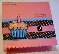
I just LOVE cupcake cards! Look at this adorable Birthday Cupcake set that was just released at Tree House Stamps! I was so excited to get to play with these stamps, and with all the stuff I've had going on Tuesday through Thursday I didn't get to play until early this morning, a day late for the going green WT challenge, but going green nevertheless! This paper is called Twitterpated...I think just the sound of it is adorable! It is really beautiful paper, and almost looks enameled in bright bold color. I wanted to make a card that would take advantage of the two-sided print, so this is what I ended up with. It is a 5.5 inch square single layer card base matted with the stripe, with a 4.25 inch square floral/dotted card mounted on that. I scalloped the bottom of the card with my SU scalloped edge punch, which revealed the bold red polkadots from the inside.
The cupcake was stamped in Memento Tuxedo Black ink, then colored in with a combination of SU and copic markers. I stamped another and cut out the icing, then colored it with copics and embossed it with a half-and-half combination of clear EP and Iridescent Ice EP. I popped just the bottom part of it up on dimensionals and glued the top down to the original layer to make it look as 3-D as possible, then mounted the whole thing to a scalloped circle punched with a Marvy Giga punch. For the inside, I stamped the sentiment on a square of white matted with real red...the picture sort of captures the gloss of this delicious paper!
Just to catch you up a little bit on what I've been up to this week...I attend a Precept study at NAS Jacksonville. Tuesday that group started a study of Isaiah, which is going to be phenomenal! I also teach a women's study at my church, Fleming Island United Methodist Church. Wednesday we began a new Beth Moore Bible study called Stepping Up into Psalms (a study of the Psalms of Ascent). When I first opened the cover, I had to smile and even giggle...there was a diagram of Solomon's Temple and since I SO loved her study of the Tabernacle, I just know I'm going to LOVE this one too.
Thursday I taught a basketry class to 8 homeschooled girls. This is the sample basket I brought, which is so old that the original rich brown accents have faded so much they almost match the natural reed of the rest of the basket. I dyed some beautiful rose pink reed for the girls.
This was a really adventurous basket to teach for a first lesson, but I love it because it gives a sampling of several different techniques to give a true taste of what basketry is all about. The girls learned to weave a flat reed bottom, and how to twine and do 3-rod wale. They finished off with a lacy decorative border. I was so proud of these girls, and of how their baskets turned out. As they worked, you could see the personalities of each girl emerge, both on their faces and in their work. Although they all worked from the same model, their baskets were very different! I hope they enjoyed the class as much as I did!
Wednesday, March 11, 2009
ATC + Sketch=
a cute card! Or at least I hope you think so!
I just love these Caring Critters! This set was illustrated by Jami Bova for 2RedBananas.
You may have already seen the ATC I made for last Thursday's WT challenge. When I saw today's sketch with only 30 minutes to craft before I had to leave for Bible study, I instantly thought of this little ATC as a head start to today's card. The darling bunny was already colored and shaded with Copic markers, cut out, waiting and ready too. His cute little tail sparkles with Spica clear glitter. All I had to do was assemble the card base and attach the separate elements. Sounds easy enough right? Wellll....LOL! I think I spent most of my 30 minutes searching through my stash trying to find my sticker sheet of Kaiser pink pearls! It wasn't where it was supposed to be! :p
This card is a 5.5 inch square card cut from Pink Pirouette, layered with Baja Breeze. The floral background of Imaginisce Love is in the Air is accented with the companion stripe, Weak in the Knees. All the edges of the paper were distressed and lightly inked with Old Olive. The ATC and bunny were positioned with dimensionals and pop dots, and those elusive pearls finally found their way onto the top left corner!
Color Dare!
It's Color Dare time again. I must admit that certain color combos have made me cringe, and others have instantly inspired a certain idea for a stamp to use. This week was one of those easy weeks. The challenge was to use Perfect Plum, Old Olive, and Gable Green. After looking through a few stamp sets, I knew exactly which one I wanted to use!
Variety brings so much interest to stamping...I find it really fun to sometimes make a clean and simple design, and another time to create something fancy and frilly and frou frou. Today's card is one of those quick, easy designs. I stamped the image (SU's retired hostess set, A Little Bit of Happiness) using Palette Noir ink, then colored it in using prisma color pencils and baby oil. It took a little layering of colors to get a match for these colors of cardstock. I really wanted to use my Martha Stewart doily-lace edge punch, but it won't punch through card stock any more, so I grabbed SU's scallop punch instead. This is one design that I think I will use over and over again...it is quick, easy, and yet still pretty. I hope you like it!
Sunday, March 8, 2009
Banana Split Sunday!
Today is the first of a new challenge brought to you by 2RedBananas! It is called Banana Split Sunday! Each week will be different...sometimes a sketch, perhaps some inspiration, a theme, a list of specific supplies to use, etc...something that will a-peel (pun intended!) to everyone! A weekly "top banana" will be randomly chosen, and on the 2nd and 4th week of the month, there will be a prize! Doesn't that sound scrumptious?!
This week's challenge is a sketch...feel free to rotate, flip, or manipulate the sketch, add or drop layers, etc., so long as it is still recognizable! Upload your creations to SCS using the keyword 2rbbss01.
Somehow or another I missed the memo about the Friday deadline for my challenge submission (it was right there in the email I got, in black and white...what can I say, except sorry Jami!). I spent my Saturday morning at a reFocus seminar for our church, and then when I got home went straight to work on my card. I wanted to use a 2RedBananas stamp set that hadn't seen ink yet (I still have several!) and after a morning of discussing our church's vision and mission statement, it seemed appropriate to use this beautiful cross and companion scripture about Unity and Love from the set Wrapped in His Love.
I inked the cross using SU's ruby red classic ink and colored the ribbon with prismas and baby oil topped with a Spica clear gel pen. I chose these colors with Imaginisce's Love Me/Weak in the Knees designer paper in mind. I used an oval nestabilities die to cut the image, then bordered it with a scalloped oval. All of the edges were inked with Tim Holtz distress ink. I was originally planning to use primas around the oval as the sketch illustrates, but the primas covered the beautiful Love is in the Air floral print too much for my liking and distracted from the image of the cross, so I opted for 10 pale yellow dewdrops instead. I'm really into liturgical symbolism, so I love the idea of the red cross representing the blood of Christ...the 10 dew drops make me think of the 10 commandments. For the inside of the card I inked the entire sentiment with Pretty in Pink ink, then markered over the words Love and Unity with a Ruby Red marker, stamping it in the bottom corner of some ivory cardstock topped with a bit of striped paper.
I hope you'll play along with our new Banana Split Sunday challenge every week! We have lots of delicious stuff planned!
Saturday, March 7, 2009
Better Late than Never!
Yesterday was the best day! I drove just down the street to pick up my new friend Asela to go to A Small Cleverness to shop for stamps, and then to Applebee's for lunch. We had a great time and found that we have so much in common! It is not often that you meet someone and feel that you have been long-time friends, but that was definitely the case yesterday!
The only thing that could possibly have made the day any better would have been if Latisha had been able to go with us...that was the original plan, but she was not feeling well and had to stay home. She was sorely missed, and we all have agreed that we'll just have to make plans to get together again as soon as possible, when Latisha is well enough to get out and enjoy herself!
I bought this stamp (Penny Black's Wind Caressed) with my new Copic markers in mind, and couldn't wait to try my hand at Dawn's LSC challenge. I had to keep the layout very simple because I spent the majority of my 30 minute time-limit coloring. I had to use an SU marker for the stems because so far in Copics I only have yellows, browns, violets, and pinks...but I am pleased with the way my card turned out. I love the little bit of glitz that the gold Spica glitter pen gives the stamen.
I also bought one of Asela's sets, Flowers for Daisy. It was so cool to actually be WITH her and purchase a set she illustrated! I couldn't help but grin! Can't wait to make a card with it! She was a real sweetheart and brought me some stamped images and other goodies too, so I have a head-start on some cards! Thank you, Asela! Can't wait to see you again! {{hugs}}
Thursday, March 5, 2009
Today's WT--ATC's!
I don't think I've ever made an ATC before, but I really wanted to try today's WT challenge because I had so much fun making Rolodex cards for a Challenge Chaser swap I participated in a while back, and this seemed similar. I had this cute little bird, part of a set called Caring Critters illustrated by Jami Bova for 2RedBananas just waiting to be inked, and the image seemed the perfect size...I stamped it in Memento Tuxedo Black, then colored it with prismas and baby oil, adding a little bit of grey shading with Copics under the bird's wings and under the limb/leaves. Then I stamped it once again, cutting out his body and right wing. I adhered his body with tape, and popped the wing tip up with dimensionals. Next I used my nesties to cut a scalloped oval frame to place atop this beautiful striped designer paper, Loves Me/Weak in the Knees by Imaginisce. Thankfully I am planning to use this as a focal image for a card, or I would have really been distressed about covering up those pretty stripes! A few Kaiser pearls accent the ticket-punched corners.
Hopefully sometime tomorrow I'll be able to finish a card with this as a great head-start! I hope you'll come back to see it! It won't be until after I've returned from stamp shopping and lunch with Asela and Latisha! I'm SO excited that we are planning this get-together! I hope it is the first of many! I admire them each so much and look forward to learning from them and just enjoying their company!
Wednesday, March 4, 2009
To post...
...or not to post? That is the question! LOL!
Do you ever work on a card for a while and just get more and more frustrated as the minutes tick by...and when you're finished you're not so happy with it but feel that you've spent so much time on it that you have to do something with it?! Well, this is one of *those* cards! Hopefully it isn't that it is so bad...it's just that I've grown tired of looking at it already! Sometimes it is good to walk away and try again later!
I wanted to make a more elegant St. Patrick's Day card, so I started with the poem from the set, Luck of the Irish, and a sheet of Sugardrop paper, both from i {heart} papers. I sponged the paper edges with River Rock ink and backed it with black...one of my all-time favorite color combos (I loved River Rock SO much and hated to see it retire). I stamped the small clover twice and punched them out with a 1/2 inch circle punch, then adhered them to build-a-brads to accent each horizontal element of the design.
I was pretty happy with things up to that point. I played around with several options for an accent for the bottom of the focal image because without something there it felt a little naked, and that was the part that got me frustrated. Finally I settled on a harmonizing prima...it isn't exactly what I was hoping for but was the best the options I had available...and now I'm just hoping that the look is gonna grow on me. We'll see!
Do you ever work on a card for a while and just get more and more frustrated as the minutes tick by...and when you're finished you're not so happy with it but feel that you've spent so much time on it that you have to do something with it?! Well, this is one of *those* cards! Hopefully it isn't that it is so bad...it's just that I've grown tired of looking at it already! Sometimes it is good to walk away and try again later!
I wanted to make a more elegant St. Patrick's Day card, so I started with the poem from the set, Luck of the Irish, and a sheet of Sugardrop paper, both from i {heart} papers. I sponged the paper edges with River Rock ink and backed it with black...one of my all-time favorite color combos (I loved River Rock SO much and hated to see it retire). I stamped the small clover twice and punched them out with a 1/2 inch circle punch, then adhered them to build-a-brads to accent each horizontal element of the design.
I was pretty happy with things up to that point. I played around with several options for an accent for the bottom of the focal image because without something there it felt a little naked, and that was the part that got me frustrated. Finally I settled on a harmonizing prima...it isn't exactly what I was hoping for but was the best the options I had available...and now I'm just hoping that the look is gonna grow on me. We'll see!
Color Dare!
Today's Color Dare was to use Basic Brown (or Chocolate Chip)
Pretty in Pink, Whisper White, So Saffron, and (optional) Going Gray. I had no Basic Brown, but I found this piece of designer paper that had browns and grays in it (DCWV Old World 8 x 8 pack), so I thought that would be a good substitute, especially with the image I had in mind, Sweet 'n Sassy's set His Eye is On the Sparrow. I love that song, and immediately fell in love with these graceful birds. I stamped them in Memento Tuxedo Black, then colored them with prismas and baby oil. Everything seemed so stark white against the designer paper, so I got out my SU linen background stamp and inked it up with Tim Holtz distress ink, stamping off once before stamping the image. I repeated the same process with the horizontal strip of Going Gray, just to give it an aged, distressed appearance. A pair of Saffron colored buttons tied with brown hemp bring out the tiny bit of So Saffron in the flower centers...a spiral clip with some knotted bi-color ribbon dresses it up just a bit more.
Monday, March 2, 2009
Today's Technique!
Today's TLC was a quick and easy crimped envelope card...my friend and upline Kathy showed me one of these a while back, and after seeing it in person I was excited to try one for today's challenge. Another of our friends, Vicki, had given us each a giant box of envelopes (the ones that are large enough to hold a card made from a full sheet of cardstock folded in half)...so I have enough envelopes to make a boatload of these in a rainbow of colors!
I used one of my new OCL stamp sets, Drake the Dragon, from i {heart} papers...I just love these stamps! I love the way they're stored nearly as much as I love the stamps themselves! Some come as clear acrylic, others as unmounted rubber, but they're all great! Most of them are illustrated by Marianne who taught our Copic class last weekend! She showed us her original sketchbook...so full of amazing art and absolutely fabulous Copic coloring!
I stamped this cute little dragon in Palette Noir ink, then colored him in with prismas and baby oil to match this bright Itsy Bitsy Spider paper. I used my clear Spica glitter pen to add a little glitz to his wings, ridgeback, horns, tail, and the dots of the eggs. I kept the layout very simple because of the busy-ness of this designer print. The flower is cut from the designer paper and topped w/ a button from my stash. A few knots of dotted ribbon embellish the top of the envelope that slides off to reveal the card inside.
The card inside is a 5.25 inch square. I stamped the eggs at the bottom and colored them the same as the front just to add a little fun detail to the bottom of the inside, and then added a strip of the companion striped paper across the top. I think it came out kinda cute! I hope you like it!
Subscribe to:
Posts (Atom)