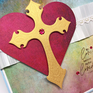
Several pads of absolutely GORGEOUS designer papers arrived in the mail this week and I could hardly decide which one to use first! I finally settled on one sheet from TWO pads because I thought they looked really beautiful together!
The soft colors of the background paper have just a tint of that brighter pink along the bottom edge, and the intensity of the hot-pink-red of the heart really brings your focus there and makes the Cross stand out front and center. (Hopefully you can see the embossing on the cross. It was a bit hard to capture on that pearly gold paper.) The clean and simple style really brings emphasis to the few elements that are there. No distractions!
Three rhinestones...for the symbolism and for the sparkle! And one more for the center of the Cross.
Supplies:
- Stamp Simply Clear Stamps - Love
- Craft Consortium Retro Summer 6x6
- Craft Consortium Over the Rainbow 6x6
- Luxury Pearlescent Metallic 105# Cardstock - Gold 15 ct
- Stamp Simply Steel Dies - Crosses
- May Arts Vintage Sampler - Pink & White w/Rosettes
- Kaisercraft Self-Adhesive Round Rhinestones - Hot Pink
- Delicata Non-Tarnishing Ink Pad - Celestial Copper
- Spellbinders Nestabilities - Classic Hearts


