Sunday, October 31, 2010

Flourishes


October has been such an incredible month! While in some ways I'm relieved that it is coming to an end, in other ways, I am hugely disappointed.

Our church has sponsored a pumpkin patch for most of the month, so I am happy that today marks the end of pumpkin patch duty! My son and I worked as a team and have put in about 15 hours altogether. In the beginning I thought I'd pack some markers and images to take so that I could color while we were there, but early on I learned that it was just too windy and/or there were too many interruptions (a good thing since it was a fundraiser!) to get much stamping accomplished. Besides, it has been really fun to see the children's delight as they come to pick out their pumpkins, sometimes in their costumes...I have really enjoyed it. I must admit that there are lots of things I could do with 15 hours of time! ;)

Florida has seen little to no rain for this month, and the air is FULL of pollen...but THAT and our battle with allergies is a whole 'nother story!


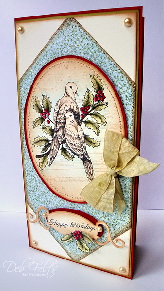
I have been so blessed to have been invited to spend the Sundays of October posting to the Flourishes blog as the Flourishes Limelight designer, and I am very sad to see that time come to an end. I loved the stamps, papers and ribbons they shared with me, and have fallen in love with cotton linen ribbon!  It has been so much fun to work with their intricate, elegant images...they are so very beautiful, and they definitely stretch my stamping skills.  Because some are realistic images of animals or flowers, I've had to research how they should be colored, adapting techniques and paying close attention to light and shadow. Julie also asked me to share some of my techniques, which really challenged me to scrutinize the way I stamp and try to identify little things I've discovered that make things work better or look more realistic. Some of the things one might take for granted are the very things that another stamper would love to find out about!

I hope you'll visit the Flourishes blog to read my final post there and learn about the two projects I've posted here as "teasers." You'll find tips and techniques, as well as links to the products I have used. I am hoping that something has inspired you or that you've learned something new to try! I'd love to hear what you think!

As busy as October has been, I'm sure, based on past experience, that November and December will prove to be just as hectic, each in their own way! Nevertheless, this is my favorite time of year to stamp, and I'm searching for a balance between real life and life in the stamping studio! 

Hoping to see you again soon! Happy Halloween, and blessings for the coming holidays!

Saturday, October 30, 2010

Happy Halloween!


I love this big ole spooky spider from the {stamps} of Life! Stephanie sent it to me quite a while back but it got tucked behind some other things until I came across it a couple of days ago.  In a way, it is kinda nice that it was outta sight, because it feels great to actually have something spooky to work on the night before Halloween.  Matthew is busy getting ready for the church youth group's costume party...I'll have to see if he'll let me post a picture!

For the card, I sponged pale yellow, apricot, orange, lavender, and black ink onto white card stock, then sprayed it with tattered angels spray and some smooth stray.  I love the misty, spooky way that this inking comes out!

I couldn't resist making a Halloween coaster while I was at it.  It doesn't get any easier than this...had to have some "atmosphere" for the picture, so I made a little cordial glass of kir.  It looks a little spooky, dontcha think?

Have fun this weekend!

Friday, October 29, 2010

Lizzie Anne Sale!


I was looking back through pictures of my cards and found a couple that I made a while back that had not been uploaded, so I'm sharing one with you today. This adorable sailboat from the August Mix, Turn Toward the Sun, is the perfect companion for October Afternoon's Seaside designer paper.  I used circle and scalloped circle nestabilities to cut and mat the layer for the image, which was stamped with various colors of ink, cut out and popped up on Zva foam dots to add dimension.  The anchor embellishment comes from June's mix, Life is Good.  I recycled a piece of rope from a Life is Good tag to knot through the double-ended tag sentiment and add to the nautical feel.  The sail is embellished with a few tiny red jewels and everything was aged with Tim Holtz tea-dye distress ink.

It was fun to keep this card really simple and just let the theme work for itself.  I hope you like it!

I hope you're looking forward to a fabulous weekend of family fun, trick-or-treating or just enjoying some beautiful Fall weather.  Lizzie Anne Designs is making your weekend EVEN MORE FUN by putting the ENTIRE STORE ON SALE 20% OFF! The sale is set to expire at midnight on October 31st. So get your orders in before then!

Wednesday, October 27, 2010

JustRite 12 Weeks of Christmas Blog Hop 8

Welcome to JustRite Stampers’ newest Wednesday feature, 12 Weeks of Christmas Blog Hops 8! Every Wednesday up until Thanksgiving some of your favorite designers will be joining some of the JustRite design team for a series of Christmas blog hops, showcasing JustRite’s entire Christmas Collection of stamps!  And don’t forget that JustRite has some Christmas stamps in their newly released CLING line of stamp sets -- you can find them HERE.  This week, the designers joining the JustRite design team are the Flower Soft and The Shabby Tea Room challenge blog design teams!  So mark your calendars for Wednesdays at 9am Central for great Christmas gift, card & project ideas, starting at the JustRite Inspiration blog!


I have always loved primitive folk art, especially at Christmas, and the colors for my card for today were inspired by the folk art look and the fun patchwork border in JustRite's set, Groovy Snowmen.

The snowman image was stamped with Memento Tuxedo Black ink on a circle of ivory card stock cut with a nestabilities die, then colored with Copic markers.  I stamped another image onto scrap card stock so I could color and cut an extra flower to adhere next to the greenery on his hat brim, which was embellished with a little bit of ultra fine pine Flower Soft.  There's also a teeny bit of ultra fine citrus crush at the flower's center.  Instead of catching a snowflake in his hand, this warm, handsome fella is holding a great big ivory Flower Soft snow ball, so you'd better duck!  ;)  He's ready to launch it!

The layout began with a scrap of Graphic 45 "The Night Before Christmas" designer paper adhered to a red card stock base.  I added a bit of sweater-textured red card stock created with a cuttlebug folder and white craft ink, and a sentiment from JustRite's Christmas Sentiments and Verses.  A strip of kraft card stock, a country blue satin bow, and a few button-trimmed ivory snowflakes punched with a Martha Stewart punch tie the whole design together.  Everything was inked with Tim Holtz tea-dye distress ink to give it that timeworn, warm country Christmas look.

I would have liked to stitch some of the edges of the paper, but didn't dare.  My sewing machine has not been working properly lately (puttputtputtzooom!)...it needs to make a trip to the repairman for a tuneup!  It is as old as the hills!  I'm almost afraid to take it in because I don't want him to tell me that it is now obsolete! 

Please visit these designers’ blogs to see what fabulous JustRite Christmas inspiration they have for you on the hop today!

JustRite Inspiration Blog

JustRite Design Team:

Sharon Harnist
Angela Barkhouse
Sankari Wegman
Stephanie Kraft
Kazan Clark
Michele Kovack
Kellie Fortin
Barb Schram
Debbie Olson
Becca Feeken
Heidi Blankenship

Flower Soft Design Team:


Jeanne Streiff
Debbie Seyer
Gini Cagle
Linda Beeson
Deb Felts
Cibele Glazer
Vicki Garrett
Dina Kowal
 
The Shabby Tea Room Design Team:


Debbie Marcinkiewicz
Nicole Segnere
Clare Buswell
Pattie Goldman
Lisa Golzbein
Cathy Clark-Sanite

Monday, October 25, 2010

From Our Home to Yours!


The deadline to finish holiday cards fast approaching...I cannot believe how fast October has flown by.  I know it is a bit hard to get in the Christmas spirit when Halloween and Thanksgiving are not even here yet, but if your household is like mine, finishing one holiday before starting to prepare for the next is simply not an option.  Life is just too hectic to wait.

Here's an easy card using the {stamps} of Life holly4Christmas that was inspired by this designer paper.  To me it looked like a pretty wallpaper print...the idea that I hope I was able to translate is that the greeting is coming from inside our home outside to yours.  I wanted it to look like a pretty wrapped package with a bow and tag.  I love this easy z-fold because it gives a simple card some quick pizazz.  This one would not be too difficult to mass produce, although it would require extra postage because of the grommet and ribbon.  I think it would be a great card to include with a hand-delivered gift for a special friend.

Sunday, October 24, 2010

More Flourishes and 7 Gypsies


I have really been enjoying my Flourishes stamps, both new and old!  I had intended to use a new floral for today's cards, but I couldn't get my mind off of this 7 gypsies paper!

I'm kinda hooked on these rolled flowers lately too!  They are so easy to make and add so much to a design...they look especially at home on this old-fashioned parlor style card.

My second card is more characteristic of my typical symmetrical style, something Julie mentioned when I first made my debut on the Flourishes blog.  I have dabbled in lots of crafts, and here I was inspired by the over-under of basketweaving to make a narrow frame for this beautiful floral image.


I hope you like both of my cards.  I have always loved the beautiful prints, textures, and florals of the Victorian era, and enjoy working with this style.  My post on the Flourishes blog goes into more detail about why I chose these products and the how-to's for what I did with them.  I'd love it if you'd visit them and let them know that I sent you!  I can hardly believe that my month in the Flourishes' Limelight is almost over!

Friday, October 22, 2010


Welcome to the GinaK Center Stage Spotlight Design Team's blog hop!  You should have arrived here from Cheri's!  If you're lost, or if you're jumping into the middle, be sure to start at Betty's so you won't miss anything!

This go-round we had a tough multiple criteria challenge:
  • clean and simple style with plenty of "white" space
  • only one layer (plus the card base)
  • one image
  • one sentiment
  • any number of embellishments, but ALL the SAME COLOR.
Sounds easy until you start working on it!  I can't tell you how many times I grabbed something and had to remind myself of the list and put it down!  In fact, I am hoping the challenge police won't buzz me for that patterned paper.  I thought since her apron was paper-pieced that it would count as a single layer!  Is it legal?

I stamped an image from Asela's set, Sew Pretty, with Memento ink onto ivory pure luxury card stock, then colored and shaded it with Copic markers before using a nestabilities die to cut and emboss a notch from the upper left corner (petite ovals small and large).   Using the next smaller die, I cut and embossed an oval for the sentiment, which was inked with markers directly to the stamp.  All of the edges of both pieces were distress inked to give them a vintage warmth.    I paper-pieced her apron and pocket with a scrap of designer paper, shading them with Copic markers to add some depth to the design.  The focal image was adhered with 1/16 inch foam tape, and the sentiment with 1/8 inch so that it is a little more prominent.  I used some scor-tape to adhere a scrap of lace to the kraft card base, then added various buttons tied in different ways with crochet cotton to finish the design.  I hope you like it!  

Next up for you is Giovana!  Her card is sure to be a feast for your eyes!

Thursday, October 21, 2010

ihp Birthday Bash Gift Card Challenge

Welcome to Day 3 of i {heart} papers' Birthday Bash!  If you missed the first two days of our celebration, be sure to visit Kate's blog post from Day 1 to catch up on all the festivities and bring yourself up to speed on opportunities to score discount coupons and free stuff!

Today I have the privilege of hosting our final challenge.  As the mom of a 16 year old son, I know the dilemma of purchasing a gift that is meaningful for the recipient versus giving cash so that they can pool gift resources and buy themselves something they really want.  I have found that a hand-made card with a gift card tucked inside is the perfect compromise...better than ever if the card can be spent anywhere!

My challenge is for you to make a card that makes a personalized presentation for a credit-card-style gift card.  There are all kinds of options available, and plenty of tutorials at your disposal to help you accomplish this task!  Just take a look at the gift card holder gallery at Splitcoaststampers.com, and then check out the project resources section to get your creative juices flowing.  There are several here too if you'd rather cut straight to the chase!

For my gift card holder, I started with a 4 1/4 x 11 1/2 inch piece of card stock scored it at 3 inches,  5 1/2 inches, then flipped and scored at 3 again...the folds, when scored, create a "w" configuration.  Apply glue to the very edges of one point of the w so that the bottom sticks together.  It is important to apply glue only to the very edges so that the inside will remain open to form a pocket for the gift card.  I used a word window punch and a round tab punch to create a shaped opening for mine.

The front and inside can be decorated any way you like.  The only important thing to consider is the closure.  It is easiest to adhere a length of ribbon to the front before adding the decorative top panel.

For my card, I used some scraps of SEI Moonrise designer paper and a matching metal filigree butterfly, a little lace, and some beautiful sheer gold ribbon.  The beaded oval frame is adorned with Zva Creative bling, and the oval die cut focal image is from one of Unity's store kits.  I used a copper spiral clip to lift the butterfly off the surface to a more realistic angle.  I kept the inside relatively simple, stamping a sentiment directly on the center section and adding designer paper to the inside of the front and back flaps.

Can't wait to see your submissions to my challenge!  You can upload your card to an online gallery (keyword IHPBB10GC) or to your blog, but be sure to come back to list your link here with Mr. Linky!

Wednesday, October 20, 2010

ihp Birthday Bash Sketch Challenge

It's Day 2 of the i {heart} papers Birthday Bash, and today Kate is hosting a sketch challenge.  I ended up making two cards for it...it is a very versatile sketch that works with lots of images, and I thought it would be fun to try it with different shapes for the focal image.  I hope you'll play along with us by making a card and uploading it to your blog or online gallery using keyword IHPBB10S.

Before I share my cards, I'd like to invite those of you who missed yesterday's Birthday Bash festivities to visit yesterday's post and join in the PARTY!  You don't want to miss the opportunity to see some absolutely amazing designs by our talented design team and friends, and to play our scavenger hunt that will give you a one-time-use 20% off coupon off of your ihp Birthday Bash purchase.  I won't go into  detail again...just take my word for it and read yesterday's post!  Don't miss it!  :)


My first card for today features a cute Our Craft Lounge penguin and some gorgeous Cosmo Cricket Mitten Weather paper.  Love these soft colors!  I softened them even more by sponging everything with distress ink.  I used an opaque white pen to add a few snowflakes to her hat, and cut apart a Zva swirlie to frame the sentiment.  The faux suede ribbon adds just a little bit of texture.


My second card also follows the sketch, although I moved the rectangular panel slightly to the side so that I could add a glamorous bow atop a strip of glimmer ribbon that hides the seam of the papers.  Isn't this Basic Grey Olivia paper just perfect for this image from Unity's Singing Souls?!  I used red and black markers directly to the stamp, then added some very faint pink shading with a pale red Copic marker.   The sentiment was stamped with white craft ink and embossed with silver EP...the decorative image at the end was stamped in the same manner as the focal image on white card stock (cut out  and adhered with foam tape) to add a pop of color.  The tip of the microphone is covered with silver Flower Soft, so this card also qualifies for the Flower Soft Sprinkle challenge, "Heavy Metal!"  It makes me laugh that in this case, that is has dual entendre.  I'm not much of a fan of heavy metal music, but this card works for me!  

Good luck with your ihp hopping, shopping, and sketch challenge crafting!  You could be the lucky one who wins a prize!

Lizzie Anne Design Team Challenge


It's challenge day for the Lizzie Anne Designs girls, and this month our challenge was to make a Christmas gift and matching card using single stamps and stamp sets we were assigned for the month. My assigned set is Christmas Magic, along with the single, Tall Snowman. Love both of these! They are reminiscent of the vintage Christmas images I used to use for tole painting before I became a totally addicted stamper!


When Santa visits our house he works very hard, and in appreciation we always leave him a plate of warm cookies with a glass of milk.  I thought it would be fun to make a jar of layered ingredients along with a card for my design team project...this will make it easy for my friends to whip up a batch of cookies for Santa on Christmas Eve (the baking instructions are on the back of the tag).  This particular recipe is made with yummy tropical trail mix...I think Santa is gonna LOVE it!  ;)


To make my gift set, I used the single, Tall Snowman, as well as a combination of images from Christmas Magic, and Love and Joy Labels.  These images and sentiments go so great with this fun Christmas paper (Basic Grey Eskimo Kisses) from last year.  I just LOVE this old-fashioned font for Christmas!  Everything was stamped with Memento ink and colored with Copic markers.  Santa's hat was given some Flower Soft Polar White fuzzy texture, and I couldn't resist adding Rudolph with his nose so bright to the layout!  I used the last little bit of olive green May Arts ribbon that I had...if I had had more I would have wrapped the jar band with it and made a big pouffy bow!  To be truthful, the bow on the top of the jar was originally on the card, but I had to move things around and substitute some buttons because I just didn't have enough ribbon to go around.  I'll be ordering more!


I hope you enjoy visiting the LAD blog and the blogs of all the Lizzie Anne girls and that you are inspired to start early for your holiday gift preparations.  I am hoping to get a head start myself!